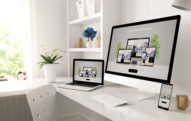
In today’s digital world, people browse the internet on all sorts of devices, from smartphones to tablets and laptops. To provide the best user experience for your customers, your website should be responsive, which means that it adapts depending on the device being used to view it. Responsive web design is all about ensuring a webpage can adjust correctly on different screen sizes and devices.
Benefits of Responsive Web Design
1. Meeting user expectations
Having a responsive website helps to improve the experience for users visiting on mobile devices, which is important as more and more people are using mobiles or tablets to access websites.
2. Consistency across devices
With a responsive website, no matter what device you are using the website will have the same look and feel. Users should be able to easily navigate and access all the information they need, resulting in higher engagement rates.
3. Improving SEO performance
While responsive web design has a lot to do with users, it also really helps to boost your organic rankings. Search engines prioritise mobile-friendly websites in results pages, and even implemented a mobile-first ranking signal a couple of years ago.
4. Reducing bounce rate
A great user experience will keep people on your website for longer, and will encourage them to explore multiple pages upon arrival to your website. A low bounce rate indicates that both the design of the website and the content are engaging and provide a positive user experience.
5. Improving conversion rates
The main goal of any website is to convert visitors into customers, whether you are selling a product or a service. If the checkout process on mobile is difficult, or they have to zoom in to read the content, visitors are likely to leave the website and go elsewhere. A responsive website provides a seamless user experience, encouraging visitors to carry out the desired actions.
6. Saves cost and time
By having a responsive website, there is no need for two separate versions – a mobile & a desktop version of your website. This also means that any maintenance carried out on the website is quick and easy, and development costs are reduced significantly.
7. Future-proofing
A responsive website is ready for the future. They are able to adapt to new technologies and devices that may be launched, enabling you to sustain a competitive advantage. An investment well worth making!
Elements of Responsive Web Design
Now that we have swayed you with the importance of a responsive website, let’s have a look at some of the key elements to create a responsive website:
1. Fluid grids
Fluid grids are the elements that allow the website’s layout to adapt to the size of the user’s screen. Rather than using fixed pixel sizes, relative units such as percentages should be used, allowing elements to resize themselves to fit any screen.
2. Flexible media and images
It isn’t just the design of the website itself that needs to be flexible, but also the content placed on it. CSS techniques, including max-width:100, should be used for images and media, as this will allow them to automatically scale according to the device being used.
3. Mobile-first approach
As we have touched upon, a responsive website should be designed for mobile devices in the first instance, with the ability to progressively enhance it for larger screens. A mobile is the smallest device a user will view a website with, so this is the best device to base the website on before scaling it up.
4. Breakpoints
Breakpoints are specific screen sizes at which the website’s layout and design changes. By defining these at the start of the development process, designers can optimise the user experience at different screen sizes.
5. Intuitive navigation
A clear navigation structure is essential on all websites, as this allows users to find exactly what they are looking for. Logical menus, breadcrumbs (so visitors can follow their paths back), and search functionalities are all important to provide the best user experience.
The Future of Responsive Web Design
Technology is constantly evolving, so responsive web design is only going to get more and more important. With new devices and screen sizes being launched on a regular basis, websites have to be able to adapt to these in order to retain visitors. Technologies such as Artificial Intelligence (AI) and voice assistants are also going to aid the design of websites moving forward.
If you are looking to future-proof your website with a responsive design, get in touch with our expert team of web designers and developers to see how we can help.